Setting up a social media analytics dashboard is about more than just tracking likes and shares. It’s about turning all that raw data into a powerhouse for smart business decisions. This is how you go from simply counting clicks to understanding why people are clicking and how that ties directly to your bottom line.
Look Beyond Likes to Unlock Real Business Value
It's so easy to get fixated on vanity metrics. A surge in followers or a post that gets a ton of likes feels great, but what does it actually do for the business? Without a proper analytics dashboard, you're flying blind, lost in a sea of numbers that don't tell the full story.
A well-built dashboard cuts through that noise. It’s a strategic shift from using social media as a megaphone to treating it as a vital source of customer intelligence. A good dashboard doesn't just show you data; it tells you a story about your audience, your brand, and where you fit in the market.
Making Smarter Decisions with Data
Instead of just guessing what your audience wants, a dashboard gives you cold, hard proof. You can pinpoint which topics spark real conversations, which ad creatives are actually sending people to your website, and which platforms are bringing in the highest quality leads.
This is where the magic happens. You might discover that your Instagram posts get tons of likes, but it's the long-form articles on LinkedIn that are driving demo requests. That kind of insight is gold—it tells you exactly where to invest your time, energy, and budget.
Uncovering Customer and Competitor Insights
Your dashboard is also a window into what your customers are thinking and what your competitors are doing. It's your secret weapon for gathering market intelligence.
You can start to understand things like:
- Customer Sentiment: What’s the general vibe around your brand? Tracking whether conversations are positive, negative, or neutral helps you protect your reputation and jump on potential problems before they blow up.
- Competitor Performance: You can monitor a competitor's share of voice, see their engagement rates, and even identify their top-performing content. This often reveals gaps in their strategy that you can swoop in and fill.
- Emerging Trends: By keeping an eye on specific keywords and industry conversations, you can spot trends as they're just starting to bubble up, allowing you to create relevant content that puts you ahead of the curve.
A great dashboard turns social media from a reactive, "post-and-pray" channel into a proactive intelligence-gathering machine. You can start anticipating what your customers need and stay a step ahead of the competition, which can influence everything from product development to your core marketing message.
The value of this kind of data is undeniable. The social media analytics market is projected to explode from USD 9.32 billion in 2025 to USD 21.71 billion by 2030, all fueled by the more than 5.24 billion people using social media worldwide. If you want to dig deeper, you can read the full research about the social media analytics market to see just how massive this space is becoming.
Pinpointing Your Goals and Essential KPIs
Before you even touch a dashboard-building tool, let's get one thing straight. Building a social media dashboard without clear business goals is like setting sail without a compass. You’ll be busy, sure, but you'll have no idea if you're actually getting anywhere. A truly effective dashboard social media analytics setup is built to answer your most important business questions, not just show off flashy, feel-good numbers.
The first step is always to draw a direct line from your social media activity to real business outcomes. What are you actually trying to accomplish? Are you aiming to feed more qualified leads to your sales team? Is the main goal to boost customer retention with top-notch social support? Or are you focused on carving out brand awareness in a new market?
Each of these goals demands a completely different set of metrics. Without that clarity, you'll inevitably fall into the vanity metrics trap—celebrating follower counts and likes that don't move the needle on revenue. Your dashboard's job is to cut through that noise and put a spotlight on the key performance indicators (KPIs) that really matter.
From Business Objectives to Actionable KPIs
Once you've nailed down your big-picture business goal, you can start working backward to pick the right KPIs. This is how you turn a broad objective into something you can actually measure and track on a dashboard. It’s the critical link between what your leadership team cares about and what your social media manager is doing day-to-day.
Let's say your primary goal is to increase brand awareness. In that case, simply tracking follower growth isn't going to cut it. Instead, you need KPIs that measure your visibility and influence within your industry.
For a brand awareness campaign, you’d want to track things like:
- Share of Voice (SOV): This tells you how your brand’s visibility stacks up against competitors. It answers the question, "Of all the chatter about our industry, what percentage is about us?"
- Reach: This is the total count of unique people who saw your content. It shows the true size of your potential audience and how far your message is traveling.
- Impressions: This tracks the total number of times your content was displayed in a feed. A high impression count means your content is getting seen frequently.
This diagram perfectly illustrates how raw social interactions are processed through a dashboard to generate real business value.
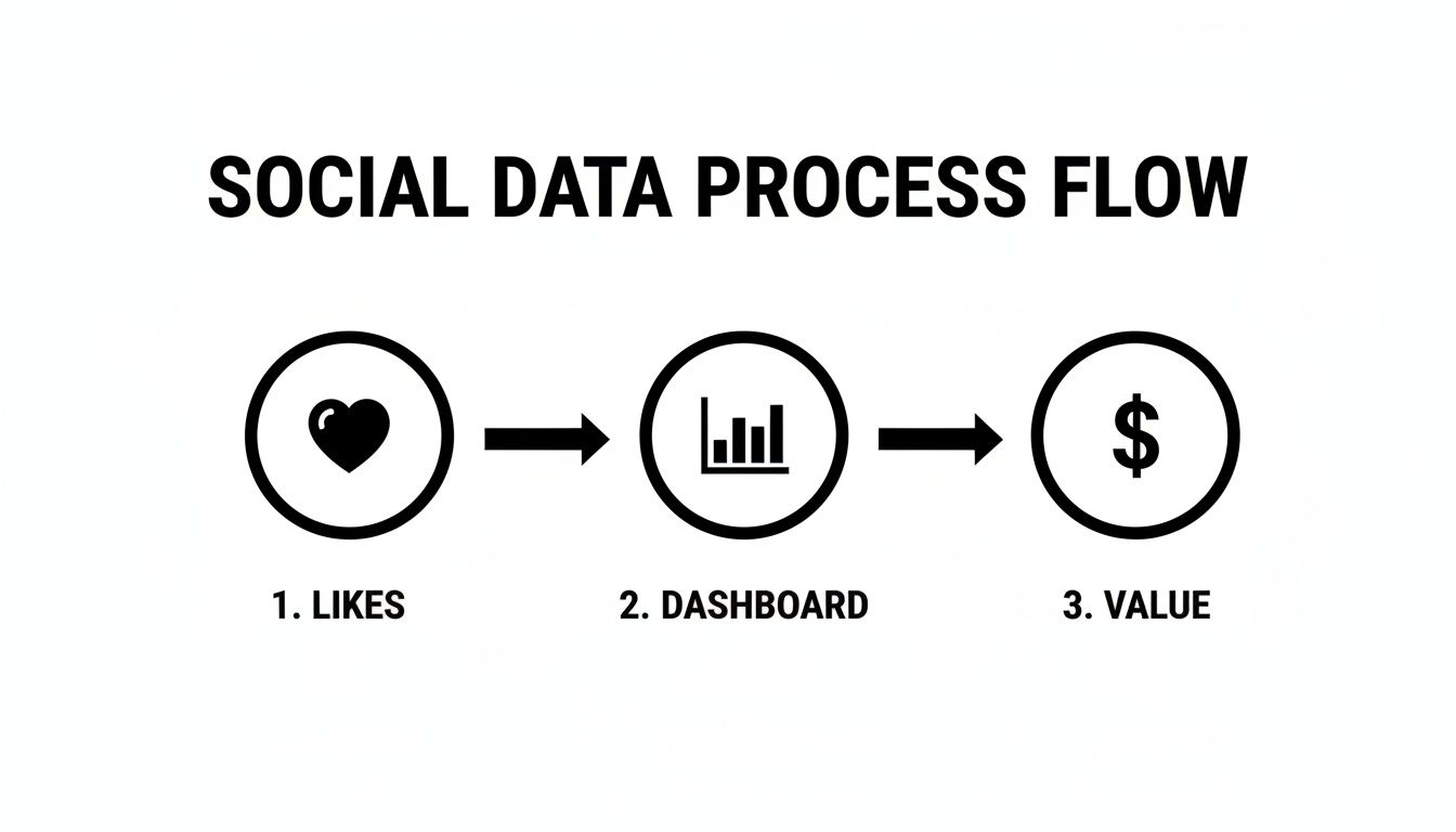
As you can see, the dashboard isn't just a reporting tool; it’s the engine that turns simple engagement signals like "likes" into measurable business outcomes.
To make this connection even clearer, here’s a table that maps common business goals to specific social media KPIs you should be tracking.
Mapping Business Goals to Social Media KPIs
| Business Goal | Relevant Social Media KPI | What It Measures |
|---|---|---|
| Increase Brand Awareness | Share of Voice (SOV) | Your brand's visibility compared to competitors. |
| Generate Leads | Conversion Rate | Percentage of users who complete a desired action (e.g., form fill). |
| Improve Customer Retention | Response Time & Rate | How quickly and consistently you respond to customer inquiries. |
| Drive Website Traffic | Click-Through Rate (CTR) | The percentage of viewers who click a link in your post. |
| Build Community | Engagement Rate per Post | The level of interaction (likes, comments, shares) on your content. |
This table is just a starting point, but it shows how every metric on your dashboard should have a clear purpose tied back to a larger business objective.
Aligning Metrics with Sales and Lead Generation
If your focus is squarely on driving sales or generating leads, your dashboard needs a different set of KPIs. Here, engagement is only a stepping stone to a much more important action. A deep understanding of your audience is non-negotiable; take the time to create B2B buyer personas to ensure your strategy is targeting the right people.
Your dashboard should be laser-focused on metrics that demonstrate a clear return on investment (ROI). You're tracking the entire journey from a social media click all the way to a closed deal.
- Conversion Rate: This is the gold standard. It’s the percentage of users who clicked a link in your post and then completed a specific action, like signing up for a demo or buying a product.
- Click-Through Rate (CTR): This tells you how many people who saw your post were compelled enough to actually click your link. A high CTR means your copy and creative are hitting the mark.
- Cost Per Acquisition (CPA): For any paid social campaigns, this metric is crucial. It tells you exactly how much you're spending to get one new customer through that channel.
The best social media analytics dashboards are custom-built for a specific purpose. A dashboard for a community manager will look completely different from one built for a CMO. The guiding principle should always be: does this chart help me answer the question, “Are we hitting our goal?”
Ultimately, a solid foundation of well-defined goals and KPIs is everything. To get more granular on this, our guide on https://replymer.com/blog/how-to-measure-social-media-engagement offers a detailed framework for selecting the metrics that will truly reflect your success. It all comes back to choosing measurements that align directly with what you want your business to achieve.
Choosing Your Analytics Tools and Data Sources
Alright, you've got your goals and KPIs locked in. Now comes the fun part: picking the tech that will actually bring your dashboard social media analytics to life. The tools you choose will seriously impact the quality of your insights and how efficiently you can work, so it’s a decision worth getting right.
And make no mistake, this is a booming industry. The global social media analytics market was valued at a hefty USD 10.26 billion in 2024 and is on track to explode to USD 35.88 billion by 2030. That's a massive annual growth rate of 23.20%. This surge is largely fueled by companies in North America (which holds 33.0% of the market) who are using data to make smarter, faster decisions. You can see the full market breakdown here if you're curious.
This massive market means you have a ton of options, which is both a blessing and a curse. Let’s cut through the noise and figure out what you actually need.
Start with the Free Stuff: Native Analytics Platforms
Before you pull out the company card, your first stop should always be the analytics tools baked right into the social media platforms themselves. They are surprisingly robust, totally free, and give you a ground-level view you can’t get anywhere else.
- Facebook Insights: This is your go-to for deep data on page performance, post reach, and audience demographics. It's fantastic for figuring out who your followers are and what content they actually care about.
- LinkedIn Analytics: Invaluable for B2B. It breaks down your company page visitors and follower demographics by things like job function and seniority, plus shows you how your individual posts are performing.
- X (Twitter) Analytics: Gives you a quick 28-day performance snapshot showing impressions, profile visits, and mentions. You can also drill down into the data for every single tweet.
These platforms are the source of truth. They provide the raw data you need to build a foundational dashboard and are essential even if you layer a more sophisticated third-party tool on top later.
Level Up with Third-Party Dashboard Tools
While native analytics are great, they keep your data in separate silos. To see the whole picture—how all your channels are working together—you'll eventually need a third-party tool. These platforms pull all your data into one place, saving you from the soul-crushing work of manually copy-pasting numbers into spreadsheets.
They usually fall into one of three buckets:
- All-in-One Social Media Management Suites: Think Sprout Social or Hootsuite. These combine scheduling, monitoring, and analytics into a single command center. They're perfect for teams who want one tool to manage everything from publishing to reporting.
- Specialized Analytics and Listening Platforms: Tools like Brandwatch are built for deep-dive analysis. They're masters of advanced sentiment analysis, competitive benchmarking, and spotting market trends by sifting through millions of online conversations.
- Business Intelligence (BI) and Data Visualization Tools: This is where you get ultimate flexibility. Platforms like Tableau, Power BI, or the free Looker Studio can connect to almost any data source you can imagine (well beyond social media) and let you build completely custom dashboards from the ground up. The trade-off? They have a steeper learning curve and require a bit more technical know-how to set up.
The best tool for you isn't the one with the most features; it's the one that solves your biggest problem. All-in-ones are for workflow efficiency, specialized platforms are for deep insights, and BI tools are for total customization.
How to Make the Right Call
Choosing a platform is a big commitment. To avoid buyer's remorse, run every potential tool through this checklist. You can also find a detailed social media monitoring tools comparison to help guide your decision.
Here's what to look for:
- Budget: Let's be real, this is usually the starting point. Options range from powerful free tools to enterprise platforms costing thousands a month. Know what you can realistically spend before you start looking.
- Scalability: Will this tool grow with your brand? Think about whether it can handle more social profiles, more team members, and a much larger volume of data down the road.
- Integration Needs: Does it play nice with the other tools in your world, like your CRM or Google Analytics? Connecting these dots is crucial for proving ROI and seeing the full customer journey.
- Ease of Use: A powerful tool is useless if your team finds it intimidating. Always, always get a demo. If you can, sign up for a free trial and have your team kick the tires to see if it feels intuitive.
Ultimately, you’re piecing together a tech stack that serves the goals you already set. Whether it's a simple setup using native analytics or a complex system built with a BI tool, the right choice will transform your data from a bunch of numbers into your most valuable strategic weapon.
Designing a Dashboard That Tells a Clear Story
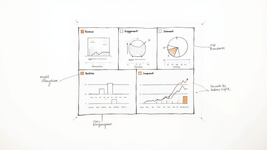
You can have the best data and the most expensive tools, but if your dashboard is just a chaotic jumble of charts and numbers, you’ve got noise, not insight. A powerful dashboard social media analytics setup doesn’t just show data; it tells a clear, compelling story about what’s happening.
The real goal here is to create a visual narrative that answers your most important business questions at a glance. Every single element needs to earn its spot. Before you drop in a new chart, ask a simple question: "What decision will this help someone make?" If there isn't a good answer, leave it out. A well-designed dashboard naturally guides the eye from high-level takeaways right down to the nitty-gritty details.
Laying Out Your Visual Story
One of the biggest mistakes I see is people treating their dashboards like a digital junk drawer, cramming every metric they can find onto one screen. A much smarter approach is to structure it like a pyramid, with different layers of detail for different people in your organization.
- Top Level (The Executive Summary): Keep the top of your dashboard clean and simple. This is for the C-suite or key stakeholders who only have 30 seconds. It should feature just a handful of your most critical KPIs—think total ROI, leads from social, or overall brand sentiment.
- Mid Level (Performance Deep Dive): As you scroll down, you can start breaking things down by platform or campaign. This section is built for marketing managers who need to see what’s working and what isn’t. Here you might compare engagement rates between networks or track the ROAS of specific ad campaigns.
- Bottom Level (Granular Analysis): The final section is for the deepest dive. This is where you could have a detailed table showing the performance of every single post. It’s perfect for a content creator who needs to understand exactly which topics and formats are hitting the mark with your audience.
This top-down structure ensures everyone gets what they need fast, whether it's a CEO checking on major goals or a social media manager looking to tweak next week's content calendar.
Choosing the Right Visuals for the Job
The type of chart you use is everything. Using the wrong visualization can actively mislead people, even when the underlying data is perfectly accurate. It’s about picking the right tool for the story you want to tell.
Here’s a quick guide to making the right choice:
- Line Charts are your best friend for showing trends over time. Use them to track things like follower growth, website traffic from social, or brand mentions on a monthly or quarterly basis.
- Bar Charts are perfect for making comparisons. They’re great for showing which social platform drives the most engagement or which campaign generated the most conversions.
- Heat Maps can be a game-changer for figuring out the best times to post. They visually represent engagement by day of the week and time of day, making it incredibly easy to spot those engagement hotspots.
- Scorecards or Big Number Widgets are must-haves for your top-level KPIs. They display a single, crucial metric in a big, bold format that no one can miss.
Pro Tip: As a rule, just avoid pie charts. While they might look simple, the human eye is terrible at accurately comparing the size of angled slices. A simple bar chart is almost always clearer and more honest when you need to show parts of a whole.
Adding Context and Clarity
Data without context is just numbers on a screen. A couple of final touches—strategic color-coding and annotations—can turn a good dashboard into a great one.
Color should be used with purpose, not just to make things look pretty. Assign a consistent color to each social network (e.g., blue for Facebook, light blue for X/Twitter) across all your charts so they’re instantly recognizable. You can also use color to signal performance—green for hitting a goal, red for falling short—giving viewers an immediate visual cue about what needs attention.
Annotations are your secret weapon for explaining what the data means. Did your reach suddenly spike last Tuesday? Add a small note directly on the chart: "Our post about the new feature went viral." This context is invaluable for anyone looking at the dashboard later, preventing them from jumping to the wrong conclusions.
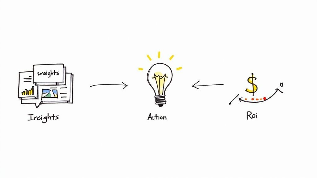
Turning Your Data Into Decisions and Proving ROI
This is where all your setup work really comes to life. A well-built social media dashboard is much more than a pretty collection of charts. It’s the engine that turns raw numbers into smart business decisions and, just as importantly, proves that your social media efforts are actually paying off.
We're moving beyond just reporting what happened. The goal is to understand why it happened. It’s about learning to spot trends, notice when something is off, and draw real, actionable conclusions from the story your data is telling.
Analyzing Trends and Spotting Anomalies
Your dashboard isn't static; its true value emerges over time. Avoid the trap of only looking at today's numbers. How do they stack up against last week, last month, or even this time last year? Was that spike in engagement last week a one-off viral hit, or is your engagement rate consistently climbing?
Think of your dashboard as a tool for answering critical questions about performance:
- Spotting Trends: You notice a line chart showing a steady three-month climb in website clicks from your LinkedIn posts. That's not an accident; it's a clear signal that your content strategy there is hitting the mark. The insight? Double down on what's working.
- Identifying Anomalies: A sudden, sharp drop in your Instagram reach could be a sign of an algorithm change. Catching this anomaly early means you can investigate and adapt your strategy right away, instead of wondering why your numbers are down weeks later.
- Drawing Conclusions: If you see that posts featuring customer testimonials consistently get your highest engagement rates, the conclusion is simple: your audience responds to social proof. This insight should directly influence your content calendar for the next month.
This kind of proactive analysis turns your dashboard from a passive report into an active command center. You can be more agile, jumping on opportunities and heading off problems before they become serious.
Measuring the Elusive Organic Social Media ROI
Calculating the Return on Investment (ROI) for paid ads is pretty straightforward. You spend X, you make Y. But how do you prove the value of all the time and effort you pour into organic social media? It's a classic marketing challenge, but your dashboard holds the key.
The trick is to look beyond direct, last-click sales. You need to measure how your social media activity contributes to the entire customer journey. This means tracking both financial and non-financial conversions that still have real business value.
A common mistake is undervaluing actions that don't immediately result in a sale. A newsletter sign-up or an eBook download is a high-intent action that fills your pipeline with qualified leads, and your dashboard must be set up to assign value to these conversions.
To get a much clearer picture of your organic ROI, focus on these two methods:
- Attribution Tracking: Get religious about using UTM parameters on every single link you share on social media. This lets you see in Google Analytics not just how many people came to your site from social, but precisely what they did once they arrived.
- Valuing Non-Financial Goals: Assign a dollar value to key actions. For example, if you know that 1 in every 20 newsletter subscribers eventually becomes a customer worth $500, then each new subscriber you get from social media is technically worth $25 to your business.
Tying these actions back to your social channels is the final piece of the puzzle. For a more detailed breakdown, our guide on how to calculate marketing ROI gives you a great framework for connecting these dots.
Leveraging Competitive and Sentiment Analysis
Your dashboard shouldn't just be a mirror reflecting your own efforts; it should also be a window into what everyone else is doing. By setting up widgets that track competitor mentions and industry keywords, you can keep a constant pulse on the market without leaving your dashboard.
This is how you measure your share of voice (SOV)—a powerful metric that shows how much of the conversation in your industry is about your brand versus your competitors. A rising SOV is a fantastic indicator of growing brand awareness and market authority.
At the same time, sentiment analysis acts as your brand's real-time health monitor. Is the chatter around your latest product launch positive, negative, or neutral? A dashboard that clearly visualizes sentiment can alert you to a potential PR storm before it breaks, giving you a chance to get ahead of the narrative.
This isn't a small-time game. The global social media analytics market is on a rocket ship, projected to hit a staggering USD 43.25 billion by 2030, growing at an annual clip of 27.2%. This explosion is being fueled by businesses just like yours using dashboards to understand their audience and fine-tune their content. Some retailers have even managed to boost sales by 20% just through better engagement. You can discover more insights about the social media analytics market to see just how fast this space is moving.
Alright, let's get into some of the questions that always pop up once you start getting your hands dirty with a social media analytics dashboard. It's one thing to build it, but using it effectively day-to-day is where the real learning curve begins.
These are the practical, real-world questions I hear all the time. Getting these sorted will save you a ton of headaches down the road.
How Often Should I Actually Check My Analytics Dashboard?
There’s no magic number here—it really boils down to your role and what you’re trying to accomplish right now. Think of it less as a rigid schedule and more as a rhythm that matches your goals.
Daily Peeks: If you're a community manager or you're in the middle of a big campaign launch, a quick daily check-in is non-negotiable. You're looking for fires to put out (hello, negative sentiment!) or golden opportunities to jump on. Is an ad tanking? Is a post suddenly going viral? A five-minute scan can tell you.
Weekly Reviews: This is the sweet spot for most of us. A weekly sit-down is perfect for seeing what’s actually working. You can spot content trends, see how you’re tracking against your KPIs, and make smarter decisions for the week ahead without getting bogged down in tiny, meaningless fluctuations.
Monthly & Quarterly Deep Dives: This is for the big-picture view, usually for leadership or when you're planning your next strategic move. These reports should tell a story: here are our big wins, here’s how we’re progressing toward business goals, and here’s the bottom-line ROI of our social efforts.
The real secret is to be intentional. Don't just open your dashboard because you feel like you should. Go in with a question. "How did that new video series perform?" or "Which platform drove the most link clicks last week?" That's how you turn data into action.
Can I Actually Build a Good Dashboard with Free Tools?
You absolutely can. For small businesses, solo marketers, or anyone just getting started, free tools are more than enough to make a huge impact. You don't need to drop thousands on a fancy platform to get meaningful insights.
A tool like Looker Studio (formerly Google Data Studio) is an incredible place to start. You can pipe in data from Google Analytics and use simple connectors or even Google Sheets to pull in your social stats.
Sure, you might miss out on some of the bells and whistles of paid tools, like automated sentiment analysis. But you can still build a seriously effective dashboard that tracks the essentials:
- Follower growth over time
- Engagement rates across your platforms
- Website clicks and traffic from social
- Basic conversions tracked through Google Analytics goals
Think of it this way: starting with a free tool is the perfect way to prove the concept and build a case for a bigger investment later on.
How Do I Measure ROI for Organic Social Media?
This is the million-dollar question, isn't it? It's tough, but far from impossible. The trick is to stop thinking only about direct, last-click sales. Organic social media plays a much bigger role in the customer journey.
Your dashboard is key to connecting the dots here. One of the most powerful metrics to track is Assisted Conversions in Google Analytics. This metric tells you how many times your social channels were a stop along the way for a customer who eventually converted, even if they didn't buy directly from a social post. It proves social's influence.
Another great strategy is to assign a dollar value to smaller goals. For instance, you might know from historical data that for every 10 people who download your e-book, one becomes a customer worth $1,000. That means every single download generated from an organic post is worth $100 to your business. When you start tracking these "micro-conversions," you can build a powerful, data-backed case for the financial impact of your organic efforts.
Stop wasting time on manual outreach and let Replymer turn social conversations into qualified leads for your business. Our team of real writers finds the perfect moments on Reddit, X, and LinkedIn to recommend your product authentically, so you can grow on autopilot. See how it works at https://replymer.com.


