Think of a social media analytics dashboard as your mission control for all things social. It’s a single hub that pulls in performance data from all your different channels, organizing it into visuals that actually make sense. This gives you a clear, immediate snapshot of how your entire strategy is holding up.
Your Social Media Command Center
Trying to run a social media strategy without a dashboard is like trying to navigate a new city without a map. You're moving, sure, but you have no real idea where you're going, how fast you're getting there, or if you're even headed in the right direction. It's just a series of disconnected actions with no sense of impact.
A social media analytics dashboard changes all that. It’s your command center, taking the firehose of data from platforms like X (Twitter), Reddit, and LinkedIn and funneling it into one cohesive view. No more bouncing between different native analytics tools—you get a unified look at what’s working across your entire digital presence.
From Raw Data to a Clear Story
These tools are much more than just fancy like-and-follower counters. Their real power lies in turning a mountain of raw numbers into a clear, compelling story about your brand's performance.
It's a lot like a car's dashboard. Your car doesn't just tell you the engine is on; it gives you real-time feedback on your speed, fuel level, and engine health. This lets you make smart decisions while you're driving.
In the same way, a good analytics dashboard helps you understand the why behind the metrics. It digs deeper to answer the questions that surface-level numbers can't:
- Which types of posts are actually connecting with our audience?
- Are our conversations and replies leading to real business outcomes?
- How do we stack up against our main competitors?
By visualizing this data, you can easily spot trends, see what content is a hit, and pinpoint exactly where you need to make changes. This moves your strategy from guesswork to smart, data-informed decisions.
An Indispensable Tool for Growth
The growing demand for these platforms really speaks for itself. The global market for social media analytics is massive, valued at USD 10.23 billion in 2024 and expected to skyrocket to USD 43.25 billion by 2030. A huge chunk of that growth comes from the dashboard segment, showing just how essential it is for businesses to track and fine-tune their online efforts.
A dashboard isn't just for reporting—it's a strategic asset. It provides the clarity you need to tie social media activity directly to business goals, prove your ROI, and justify your marketing budget.
Ultimately, this command center is a must-have for any modern business serious about growth. It gives you the intelligence to not just join the conversation on social media, but to lead it. While a dashboard gives you that crucial high-level view, it's even more powerful when paired with specialized monitoring. To see how these pieces fit together, check out our guide on social listening tools.
Decoding The Metrics That Actually Matter
A social media analytics dashboard loaded with charts and numbers can look impressive, but not all data tells the same story. It's easy to get caught up chasing "vanity metrics," like a soaring follower count, which can create a false sense of security while hiding real problems with your strategy. To get a true read on your performance, you have to zero in on the metrics that reflect genuine audience connection and drive business results.
Think of it this way: a massive follower count is like selling out a concert. But if the crowd is silent—no cheering, no clapping, no one buying merch—was the show really a success? The real story isn't just that people showed up; it's in how they reacted. Your dashboard needs to measure those reactions, not just count the eyeballs.
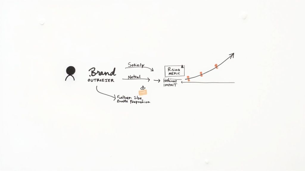
This infographic gives you a great visual of how a dashboard takes all those raw data points and weaves them into a clear story about your brand's performance.

As you can see, the dashboard is your command center, turning raw numbers into an actionable narrative. Let's break down the essential metrics that build this story, piece by piece.
Essential Social Media Metrics and Their Business Impact
To help you focus on what's truly important, this table breaks down the key metrics you should be tracking. It explains what each one measures and, more importantly, why it's a critical piece of the puzzle for making smart, strategic decisions.
| Metric Category | Specific Metric | What It Measures | Why It's Important |
|---|---|---|---|
| Awareness | Reach | The total number of unique people who saw your content. | Shows the size of your potential audience and how effectively you're expanding your brand's footprint. |
| Awareness | Impressions | The total number of times your content was displayed. | Helps you understand content frequency and whether your posts are being seen multiple times by the same users. |
| Engagement | Likes, Comments, Shares | How users are actively interacting with your content. | Signals content resonance and community health. Shares, in particular, are powerful organic endorsements. |
| Engagement | Engagement Rate | The percentage of your audience that interacted with a post. | Provides context to raw engagement numbers, helping you compare performance across posts of varying reach. |
| Conversion | Click-Through Rate (CTR) | The percentage of viewers who clicked a link in your post. | Indicates how compelling your call-to-action and offer are to your audience. |
| Conversion | Conversion Rate | The percentage of users who completed a goal (e.g., purchase). | Directly connects social media activity to tangible business outcomes like sales and leads. |
By keeping these specific metrics in view, you move beyond simply observing data and start using it to drive meaningful growth.
Awareness Metrics: The Foundation of Visibility
Before anyone can engage with your brand, they have to see you. Simple as that. Awareness metrics tell you how many people your content is reaching and how often it's popping up on their feeds. These numbers represent the very top of your marketing funnel.
Reach: This is the big one—the total number of unique people who laid eyes on your content. High reach is a great sign that you're successfully growing your digital footprint and introducing your brand to new potential customers.
Impressions: This metric is a bit different. It counts the total number of times your content was displayed on a screen, even if the same person saw it multiple times. So, if one person sees your post three times, that's three impressions but only one person reached. A high impression count compared to your reach suggests your content is being shown repeatedly to the same audience.
These two metrics are a powerful duo. If your reach is high but your engagement is flat, it could be a red flag that your content isn't hitting the mark with the new audiences you're connecting with. That's a clear signal to rethink your messaging.
Engagement Metrics: Measuring Audience Connection
This is where the magic happens. Engagement metrics track how people are actively interacting with what you post, which is how you turn passive viewers into a loyal community. Real, meaningful engagement is one of the strongest indicators of brand health.
Likes, comments, and shares are the bread and butter here. A "like" is a quick nod of approval, but a comment shows someone cared enough to stop and type out a thought. A share is even better—it's a personal stamp of approval that puts your content in front of a whole new audience that already trusts the person sharing it.
A healthy engagement rate proves that your content isn't just being seen; it's being felt. It validates your content strategy and shows you're building a community, not just an audience.
With over 5.24 billion people expected to use social media by 2025, you need a dashboard just to make sense of all these interactions. This is especially true when different platforms have wildly different benchmarks. For example, TikTok’s average interaction rate is a hefty 2.50%, while Instagram’s is closer to 0.50%. You can learn more about interpreting these numbers in our complete guide on https://replymer.com/blog/how-to-measure-social-media-engagement.
Conversion Metrics: Tying Actions to Business Goals
At the end of the day, your social media activity has to support your business goals. Conversion metrics are the critical link between your social posts and real-world business outcomes, proving that your strategy is actually paying off.
These metrics track the specific actions people take after seeing your content.
Click-Through Rate (CTR): This is the percentage of people who saw your post and actually clicked a link in it. A high CTR is a great sign that your call-to-action was clear, compelling, and relevant.
Conversion Rate: This tracks how many of those clickers went on to complete the goal you set, whether it was signing up for a newsletter, downloading an ebook, or making a purchase. This is the ultimate test of your content's power to persuade.
Tracking conversions closes the loop, giving you undeniable proof of how social media is contributing to leads and sales. To see how these metrics fit into the bigger picture, it's worth understanding the fundamentals of What is Marketing Analytics. By focusing on these three core categories—Awareness, Engagement, and Conversion—your social media dashboard stops being a confusing collection of numbers and becomes a powerful roadmap for strategic growth.
Turning Data Into Strategic Decisions
https://www.youtube.com/embed/t3cAUt7sOQg
A dashboard packed with colorful charts might look impressive, but on its own, it’s just digital decoration. The real magic happens when you connect those numbers to what you’re trying to achieve as a business. This is how raw data becomes a roadmap for making smarter, more effective decisions.
The first step is to stop focusing on a single day’s performance and start looking for trends. Your dashboard is a time machine—let it take you back. Compare your performance week-over-week, month-over-month, or even year-over-year. That historical context is where the gold is buried.
For example, did your engagement suddenly skyrocket last Tuesday? That's not a fluke; it's a clue. By comparing it to the previous weeks, you can start digging. Maybe it was a new video format you tried, a topic that was trending, or you simply posted at a better time. This kind of analysis helps you figure out what's working so you can do more of it.
Proving Your Social Media ROI
One of the most powerful things your dashboard can do is prove the return on investment (ROI) of your social media efforts. For far too long, social media was seen as a fuzzy, hard-to-measure channel. A well-built dashboard completely flips that script by drawing a straight line from a tweet or a post to real business goals like leads, sign-ups, and sales.
To do this, you have to be obsessive about tracking your conversion metrics. By following the user’s journey from a click on your social post to a final action on your website, you can put a real dollar value on your campaigns. This isn’t just about defending your budget; it’s about knowing which activities actually make the cash register ring.
By connecting social media metrics to financial outcomes, you transform your analytics dashboard from a simple reporting tool into a strategic asset that demonstrates clear business impact.
This process gives you a confident answer when a stakeholder asks the big question: "What are we actually getting from our investment in social media?" For a more detailed breakdown, our guide offers a complete walkthrough on how to calculate marketing ROI and prove the value of your work.
Using Your Dashboard for Competitive Analysis
Your dashboard isn’t just for navel-gazing—it’s a periscope into your competitors' strategies. By tracking their public metrics, you can see how you stack up and spot opportunities they’ve missed.
Here’s what to look for:
- Top Content Analysis: Which of their posts are blowing up? Are they killing it with video? Are they talking about topics you haven't even touched?
- Engagement Strategy: How do they talk to their audience? Are they lightning-fast with replies? Do they use polls and questions to get the conversation going?
- Identify Gaps: Pay attention to what your competitors aren't doing. If no one in your space is addressing a particular customer pain point on social, that’s a wide-open lane for you to own that conversation.
This kind of intel helps you fine-tune your own strategy, learn from their mistakes, and pounce on the gaps they’ve left in the market.
Responding to Performance Shifts
Let's say you log into your dashboard and see your reach has fallen off a cliff over the past week. Don't panic. This is where your analytics tool turns into a diagnostic tool. By digging into the data, you can figure out what went wrong and how to fix it.
Did you change how often you post? Did a platform algorithm just get an update? Is your latest content theme falling flat?
By piecing together the clues, you can build an action plan. Maybe it's time to A/B test some new creative, adjust your posting schedule, or shift ad spend to your best-performing content. This proactive approach turns a potential crisis into a learning experience, keeping your strategy nimble and effective. If you want to dig even deeper, it’s worth exploring different approaches to measuring social media ROI effectively.
Designing a Dashboard for Clarity and Action
A great social media analytics dashboard doesn't just hold data; it tells a story. Its job is to cut through the noise and give you a clear path forward. The goal is to move beyond just staring at numbers and instead present them in a way that makes you say, "Aha, I know what to do next."
Think of your dashboard like the cockpit of an airplane. A pilot needs to see the most critical information—altitude, speed, direction—at a glance. Everything else is secondary. In the same way, your dashboard should be built to put your most important key performance indicators (KPIs) front and center.
This means the layout has to be tailored to your actual business goals. If you're all about building a community, you’ll want to see metrics like engagement rates and comment sentiment right away. But if you're driving sales, your dashboard should scream click-through rates and conversions.

Prioritizing Your Key Performance Indicators
Before you even think about adding a chart, you have to decide what "winning" looks like for you. Your dashboard's layout should be a direct reflection of that definition. If your main goal is to get your brand name out there, your dashboard should immediately show you trends in reach and impressions.
On the other hand, if you're focused on generating leads, the first things you see should be widgets tracking your CTR and conversion rates from social. This way, every time you log in, your focus is instantly pulled to the data that directly impacts your bottom line.
A cluttered dashboard is a useless one. It’s easy to fall into the trap of tracking every metric under the sun, but resist the urge. Be selective. Create a visual hierarchy that guides your eyes from the big-picture KPIs down to the nitty-gritty details. This helps you see what's happening overall before you get lost in the weeds.
Choosing the Right Data Visualizations
How you show your data is just as important as the data itself. The right chart can make a complicated trend obvious in a split second, while the wrong one just adds to the confusion. A good dashboard uses a mix of visuals, each chosen to tell a specific metric's story.
Here are a few classic pairings that create a clear, actionable view:
- Line Graphs for Trends: These are your go-to for tracking anything over time. Use them to see follower growth, engagement rates, or website clicks on a weekly or monthly basis. You'll spot upward or downward trends instantly.
- Bar Charts for Comparisons: Need to compare performance between platforms or content types? Bar charts are your best friend. They make it incredibly easy to see which social channel drives the most traffic or whether videos get more engagement than images.
- Pie Charts for Composition: Use these with care, but they're great for showing parts of a whole. A pie chart can be perfect for showing the demographic mix of your audience or the breakdown of positive, neutral, and negative sentiment.
Matching the metric to the right visual makes your data easy to digest at a glance. You and your team can spend less time trying to figure out what the charts mean and more time acting on what they're telling you.
Creating Reports for Different Stakeholders
Not everyone in your company needs the same firehose of information. A smart dashboard strategy includes creating reports tailored to different people. Your analytics tool should make it simple to spin up these custom views.
The real power of a dashboard isn't just in the data it holds, but in its ability to communicate the right information to the right people at the right time.
Think about what different people in your organization actually need to know:
- The C-Suite Executive Summary: Your leadership team wants the 30,000-foot view. Their report should connect social media efforts directly to business goals, focusing on ROI, conversion value, and brand sentiment. Keep it short, sweet, and visual.
- The Marketing Manager's Report: This person needs more detail. They're looking at campaign performance, which channels are working best, and audience growth. Metrics like cost per acquisition and engagement trends help them make strategic calls and divvy up the budget.
- The Social Media Team's Deep Dive: This is where you get granular. This report breaks down performance post-by-post, tracks response times, and analyzes content themes. It's the daily or weekly playbook the team uses to tweak tactics and perfect their content calendar.
By setting up these customized reports, you make sure everyone gets exactly the information they need to do their job better. Your dashboard goes from being a simple monitoring tool to a driver of smart, coordinated action across the whole company.
Measuring Authentic Outreach with Specialized Tools
Your average social media analytics dashboard is great for tracking the big, flashy numbers like reach and engagement. But what happens when your strategy is more about quiet, meaningful conversations than shouting from the rooftops? This is where standard tools often fall short.
How do you prove the ROI of authentic outreach or genuine community building? These activities can feel a bit fuzzy and hard to quantify. That’s why specialized tools exist—they’re built to measure the subtle signals that point to real human connection.
Let’s imagine a startup called "Innovate SaaS." They're using Replymer to find and connect with key influencers on platforms like Reddit and X (formerly Twitter). Their game plan isn’t to spam marketing messages; it's to build actual relationships by jumping into relevant conversations and offering solid advice. A traditional dashboard might see a few link clicks and call it a day, completely missing the real story.
A specialized dashboard, on the other hand, is designed to follow the entire journey of these conversations. It looks past the simple vanity metrics to focus on what actually shows you're building trust and rapport.
Tracking Metrics That Reflect Real Connection
For our "Innovate SaaS" team, the dashboard isn't just a screen full of charts; it’s a living story of their relationship-building efforts. Instead of just tallying up likes, it highlights the specific metrics that truly matter for genuine outreach.
Here’s what they’d be looking at:
- Mentions Found vs. Replies Published: This ratio is a fantastic indicator of quality over quantity. If you're only replying to a small fraction of the mentions you find, it shows your team is being selective and only engaging where they can add real value.
- Reply Sentiment: The dashboard can analyze the tone of the responses to your outreach. A high rate of positive sentiment is gold—it’s direct proof that people see your comments as helpful and welcome, not just another sales pitch.
- Performance by Keyword: This is where you get tactical. The dashboard shows which topics are sparking the best discussions. If "project management tips" consistently gets you positive engagement, you know exactly where to focus your energy next.
This screenshot of a Replymer dashboard shows you exactly how these metrics come to life, giving you a clear view of the impact your conversations are having.
With this kind of data, you can see at a glance which platforms and keywords are your heavy hitters, allowing you to fine-tune your strategy on the fly.
From Conversation to Conversion
Let's walk through one of Innovate SaaS's interactions. A writer from Replymer, using a real, established account, stumbles upon a Reddit thread where people are venting about their current software. The writer jumps in with a genuinely helpful, detailed comment that solves the original poster's problem first, and then casually mentions how Innovate SaaS could be a good fit.
A standard dashboard would likely miss this entirely. But a specialized social media analytics tool is just getting started.
The real value of authentic outreach isn't just in the initial interaction; it's in the ripple effect it creates. A single helpful reply can lead to positive brand mentions, organic shares, and qualified inbound leads that a traditional ad campaign could never replicate.
The dashboard tracks the reply rate to that initial comment, flagging when other users chime in to thank the writer for the recommendation. A few weeks later, it might pick up a brand new, organic mention of Innovate SaaS in a completely different subreddit, with someone linking back to that original helpful comment.
That is the tangible ROI of community management. It’s about proving how one authentic interaction can plant the seeds for future conversations and create compounding brand awareness. By focusing on these deeper metrics, you can finally draw a clear line between genuine outreach and real, measurable business growth.
Common Pitfalls in Social Media Analysis
Even with a top-notch social media analytics dashboard, it’s surprisingly easy to get the story wrong. The data itself is just numbers on a screen; it’s our interpretation that gives those numbers meaning. Avoiding a few common analysis traps is what separates a simple number-cruncher from a genuine source of strategic insight.
One of the biggest mistakes is chasing vanity metrics. A sudden spike in followers feels great, but what if those new accounts are bots or people who will never buy from you? That number is hollow. Real growth comes from attracting people who actually listen, engage, and eventually convert—not just padding a number for show.
Another classic blunder is confusing correlation with causation. This happens when two things happen around the same time, and we jump to the conclusion that one must have caused the other.
The Correlation vs. Causation Trap
Let's say you launch a new ad campaign on a Monday, and by Friday, your sales are up by 15%. It's easy to pop the champagne and credit the campaign. But hold on—was there a seasonal spike you forgot about? Did a competitor have a PR nightmare that sent their customers running to you?
If you don't consider these other possibilities, you might end up pouring more money into a campaign that had little to do with the actual success. The goal is to find proof beyond a simple timeline.
Good analysis isn't just about spotting a change; it's about playing detective and ruling out other suspects to understand why it changed. Your dashboard gives you the clues, but your critical thinking solves the case.
To avoid this trap, get in the habit of annotating your dashboard. Make quick notes about marketing campaigns, product updates, major industry news, or even world events. This context is invaluable when you look back at the data and try to connect the dots accurately.
Ignoring the Bigger Picture
The final pitfall is looking at your data in a vacuum. A 10% drop in engagement might set off alarm bells, but if it happened during a major holiday week when your audience was logged off, it’s probably nothing to worry about. Context is what gives your data its meaning.
Here’s how to make sure you always see the full story:
- Benchmark Against Yourself: Always ask, "How does this compare?" Look at last month's performance or even the same month last year. This helps you quickly spot what’s normal versus what’s a real anomaly.
- Keep an Eye on Industry Buzz: Are others in your niche seeing a similar trend? Sometimes, a platform-wide algorithm change hits everyone. Knowing this stops you from trying to "fix" a problem that isn't really yours to solve.
- Segment Your Data: Don’t just stare at the big, overall numbers. Slice and dice your performance by platform, content format, or audience. You might discover that while total engagement is down, your video content on one specific platform is actually soaring.
By sidestepping these common errors, your social media analytics dashboard becomes a much more powerful and reliable guide. You'll start making decisions based on a complete and accurate picture of what's really happening, driving real, sustainable growth for your business.
Frequently Asked Questions
Even with the best guide in hand, you’re bound to have questions when you start digging into a new tool or strategy. Let's tackle some of the most common ones I hear about social media analytics dashboards so you can get started with confidence.
What’s the Difference Between a Dashboard and Native Analytics?
Think of native analytics—the insights you see inside the Instagram or LinkedIn app—as a quick snapshot. They’re great for a fast, channel-specific check-in. The problem is, they keep all your data in separate buckets, giving you a disjointed picture of your overall social media presence.
A social media analytics dashboard, on the other hand, is your command center. It pulls all that scattered data from all your channels into one place. This lets you compare performance across platforms side-by-side, figure out which networks are actually moving the needle, and build comprehensive reports without having to bounce between a dozen browser tabs. A dashboard tells you the whole story, not just a single chapter.
How Often Should I Check My Analytics Dashboard?
There’s no magic number here—it really depends on your goals and how active you are. The best approach is to build a consistent habit.
- Daily Check-ins: A quick 5-10 minute scan is perfect for spotting new brand mentions, managing active conversations, and putting out any small fires. Think of it as your morning coffee check-in.
- Weekly Deep Dives: This is your time to really see what’s working. Set aside a dedicated block to review campaign progress and identify trends from the past week. It’s how you learn what to do more of (and less of) next week.
- Monthly and Quarterly Reviews: Zoom out to look at the big picture. These reviews are essential for evaluating your long-term strategy and, most importantly, for proving your ROI to bosses and stakeholders.
The key is consistency. A regular review cadence means you're making smart decisions based on fresh data, not just reacting to old news.
Can a Dashboard Help with Content Creation?
Absolutely. In fact, it’s one of the best tools you can have for sharpening your content strategy. It helps you stop guessing and start creating based on what you know your audience loves.
By looking at your top-performing posts, you can quickly see which topics, formats (like video vs. carousels), and tones of voice are hitting the mark. You might find that posts where you ask a direct question get 50% more comments, giving you a clear playbook for boosting engagement.
You can also use it to peek at what your competitors are doing well, spotting gaps you can fill or getting inspiration for your next big idea. Your dashboard becomes a powerful content engine, fueled by real audience behavior.
Ready to measure the impact of your authentic outreach and prove its ROI? The Replymer dashboard is built to track the metrics that truly matter for genuine engagement, from reply sentiment to performance by keyword. See how it works at https://replymer.com.


